Sometimes all you want is clean simplicity inside of your home. You want no fuss. You want no chaos. And you want every space of the house to have a refreshing and open feel. That’s where neutral come in. They provide a relaxing, yet stylish, way to dress your home. But if you’re not careful you can create too many dull spaces, that’s where the right duos and trios come in. Let’s have a look at some of the best neutral paint colors for the home!
1. White, Gray & Black.

Even with the absence of color this trio brings leaps and bounds of contrast and interest. Each tone is so much different and bolder than the next when paired together. Of course if you do decide to add a color, such as those yellow florals they’ll POP with ease.{found on lonny}.
2. Light Brown & Gray.
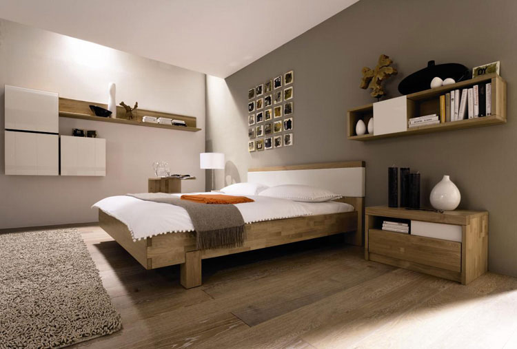
At first glance or though, grays and browns don’t seem to go together, but in fact they make quite the trendy, eclectic mix. Even if you get the brown tones from an unfinished, light wood piece, it’ll create that same refreshing and creative foundation.
3. Chocolate, White & Beige.
This is another trio that has a great contrast. Between the white and chocolate you get a stark difference and bold flavor while the beige addition will provide a subtle middle-ground building a bridge between the powerful others.
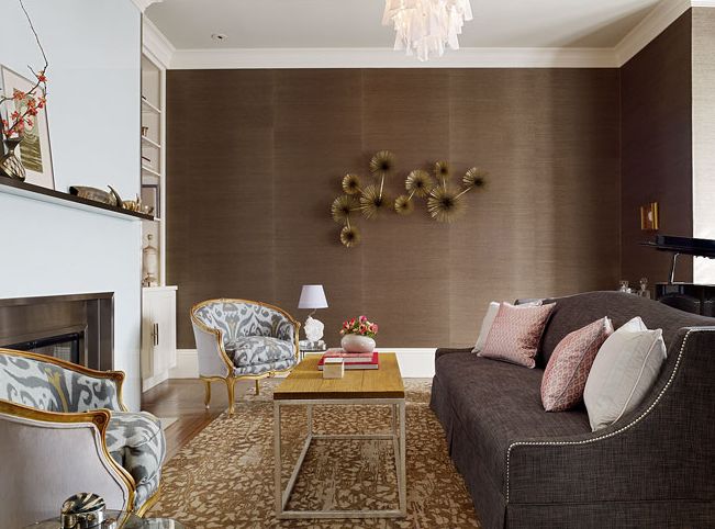
4. Black & Browns.

You’d be surprised how dramatic and statement-worthy a combination of black and browns can be. In your formal living room or even in the dining room, you could really create something special with this neutral idea.
5. All Shades of Gray.

Use a variety of gray tones when creating your bedroom, living room or even home office. It’ll be relaxing, refreshing and even give it a bit of an artistic and delicate ombre feel. You’ll love seeing every shade dance and blend together without any fuss.
6. Cream & White.

For open, airy and feminine, combine a creamy white with a crisp white for a bedroom that has the most refreshing of feelings. It can mold to a more vintage theme or modern too, but the great part of this neutral color duo is it’s revival-like presence.
7. Black, White & Taupe.

You’ve got the classic black and white color pairing but an addition of the smooth and sultry taupe shade will create a break and “colorful” addition. It’ll smooth out any bold or too cold of finishes for any room you decide to re-dress
8. White & Brown.
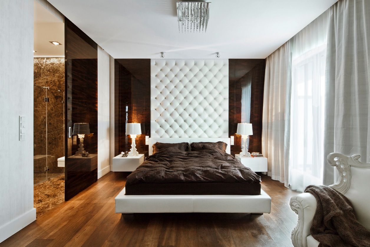
A bit more traditional and approachable than the timeless black and white. Brown and white – of all shades – creates a contrast that pops but a very open and freeing feel because of its neutral quality.
9. Brown, Gray & Cream.

Again, this may not be the most likely color trio but it’s quite fun and funky too. Even though there are night bright colors or pops of pink involved, this trio has contrast and interest without chaos or being too harsh on the eyes.
10. Black & White.

Timeless, classic and always in style a black and white room will work every time. It’s fashion-forward, works in any room at any theme and will always create the right kind of interest too.
You’re reading Interesting But Neutral Color Palettes for the Home , originally posted on Homedit. If you enjoyed this post, be sure to follow Homedit on Twitter, Facebook and Pinterest.
The post Interesting But Neutral Color Palettes for the Home appeared first on Home Decorating Trends – Homedit.
via. Home Decorating Trends